You should spend about 20 minutes on this task.
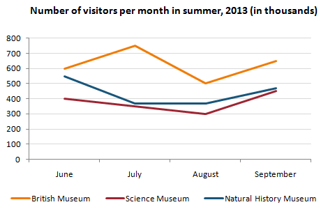
The line graph below gives information about the number of visitors to three London museums between June and September 2013.
Summarise the information by selecting and reporting the main features, and make comparisons where relevant.
Write at least 150 words.

Sample answer:
The graph shows (show) how many people visited (visit) three London museums in the summer of 2013. Most visitors went (go) to the British museum between June and September. The number fluctuated (fluctuate) between 500 and 750. By contrast, the Science Museum and the Natural History Museum received (receive) fewer visitors. The number of people who visited the Science Museum dropped (drop) gradually from 400 thousand to 300 from June to August then rose (rise) to 450 thousand in September. We can see (see) that the trend for the Natural History Museum was (be) similar. There was a sharp drop in visitors from June to July. The number remained stable (remain stable) in August and then increased (increase) steadily in September.

